Monday, September 14, 2015

Color Theory Examples

Complementary Colors


Vibrating Colors


Complement Gradation


Emotional Colors


Visual Mixing


Color Theory

Color characteristics
-color is all about context; is a property of light. As light changes, color will change.

Properties of color
  • hue: refers to the name of a color that resides on the traditional color wheel
  • value: refers to the lightness/darkness of the hue
  • saturation/intensity: the saturation of hue perceived in a color

Hue
-A property of color defined by distinctions within the visual spectrum or color wheel. “Red,” “blue,” “yellow,” and “green” are examples of hue names

Intensity
-The saturation of hue perceived in a color

Complementary colors
-A color scheme incorporating opposite hues on the color wheel. Complementary colors accentuate each other in juxtaposition and neutralize each other in mixture

Palettes
-a range of colors

Visual color mixing
  • optical mixing: when the artist places two pure colors side by side in small areas so the viewer's eye will do the mixing
  • pointillism: a system of color mixing based in a juxtaposition of small bits of pure color

Cool and warm colors
  • cool: a color closer to blue on the color wheel
  • warm: a color closer to the yellow-to-red side of the color wheel

Color as emphasis
-areas of emphasis in a work of art create visual interest; can be used to create a focal point

Color dominance
-a color that keeps it's hue despite its surroundings

Achieving balance with color
-even when a composition isn't perfectly symmetrical, designers often want to regain balance by adding and equally weighted aspect

Spatial properties of color
-value and color contrasts are more pronounced in the foreground and more subtle in the distance

Monochromatic
-A color scheme using only one hue with varying degrees of value or intensity

Analogous
-A color scheme that combines several hues located next to each other on the color wheel

Triadic
-A color scheme involving three equally spaced colors on the color wheel

Color discords
-A perception of dissonance in a color relationship

Vibrating colors
-Colors that create a flickering effect at their border. This effect usually depends on an equal value relationship and strong hue contrast

Local color
-The identifying color perceived in ordinary daylight

Arbitrary color
-a color chosen to express the artist's feelings

Emotional color
-A subjective approach to color use to elicit an emotional response in the viewer.

Color symbolism
-Employing color to signify human character traits or concepts

Wednesday, September 9, 2015

Unity and Emphasis

Visual Perception
-creating a visual unity is based on the fact that the viewer is looking something to relate the various elements
-it is basic human nature to look for pattern and unity

Gestalt
-a unified configuration or pattern of visual elements whose properties cannot be derived from a simple summation of its parts
-this is when some people see one image but then others see another image

Proximity
-the degree of closeness in the placement of elements
-simply placing objects near each other provides a sense of unity

Continuation
-A line or edge that continues from one form to another, allowing the eye to move smoothly through a composition
-this is used to show that there in some flow in the image instead of being plain

Grid
-A network of horizontal and vertical intersecting lines that divide spaces and create a framework of areas
-This is usually used in serial design & layouts in books or magazines

Unity with Variety
-the combination of two elements that create emphasis
-it makes an image become whole


Repetition
-Using the same visual element over again within the same composition
-this emphasizes the image throughout the work

Varied Repetition
-a variety amount of of repetition in one work of art
-this not only emphasizes the image but also creates more variety in the work of art

Figurative
-an image that implicates there is a figure in the work of art
-this element shows more expression and realistic representation

Abstract
-A visual representation that may have little resemblance to the real world. Abstraction can occur through a process of simplification or distortion in an attempt to communicate an essential aspect of a form or concept.
-although, this shows only the association of the actual form but not necessarily the form itself

Contrast
-juxtaposing two opposites, our eye tends to go straight to that area because it stands out from the rest of the image
-provides quality and value in the work

Isolation
-by setting something off by itself, or isolating it from everything creating emphasis
-this makes the object in the work stand out more compared to the other objects in the image

Placement
-putting something in a particular place in order to achieve something
-this creates more emphasis for the image by having it stand out based in where it's placed

One Element
-attracts more attention to the viewer by having one focus throughout the work
-mainly used when a designer only has seconds to viewer and pull them in

Emphasizing the whole
-attracting attention to the viewer with multiple focus points throughout the work
-this is mainly used with multiple medias and in utilitarian designs (maps)

Value and Motion

Relative Stillness
-everything is always in constant motion

Anticipated Motion
-implication of movement on a 2-D surface caused by the viewer's past experience with a similar situation
-movement is important because it implies something that is happening in time

Repeated Figure
-when an image is repeated throughout the work of art

Cropped Figure
-when an image is cut of to have the viewer imagine what else there could be

Blurred Outlines
-it's where and image is in "stop-action" which shows and indication of movement

Optical Movement
-it usually involves optical illusions to where is appears the image is moving within

Value
-a measure of relative lightness or darkness

Value Contrast
-the relationship between areas of light and dark

Value Patterns
-the arrangement and amount of variation in light and dark values independent of any colors used

Value as Emphasis
-use of light-and-dark contrast to create a focal point within a composition
-this adds intensity to the work of art instead of being just plain

Chiaroscuro
-the use of light and dark values to imply depth and volume in a 2-D work of art
-this technique makes images appear to be real in the work of art

Monday, August 31, 2015

Texture and Space

PATTERN
-the repetition of a visual element in a regular sequence
-It can begin with units and shape in an image; repeated

TEXTURE
-surface quality of objects in an image
1) tactical texture: creating a surface that you can feel or have a sense that it can be touched
-
2) visual texture: 2-D illusion that is implied texture

-This type of texture implies the illusion that you actually touch the painting, you could "feel" the object.

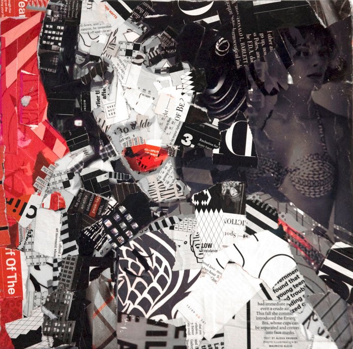
COLLAGE
-putting together a various amount of materials together on a 2-D area
-This is important because it makes the image not ordinary and has the illusion of a single image when really there are multiple images in one.

VERISIMILITUDE
-appearance that is "truly the same"
-Verisimilitude is a texture that makes the object look like how it really is.

TROMPE L'OEIL
-"to fool the eye"
-In this kind of illusion, it makes the image appear to be mare than what is really is.

TRANSPARENCY
-objects or forms allow light to pass through
-Transparency occurs when to forms overlap but both objects are seen in the image.

OVERLAPPING
-when objects are placed on top of each other in order to create a sense of depth
-Instead of images being separated, they stacked onto another and it gives more definition into the image.

TYPES OF PERSPECTIVE
1) one-point: only one vanishing point
-In one-point perspective, all the parallel lines converge into one vanishing point to make people look through one way.

2) two-point: two-vanishing points
-The image is seen at an angle where none of the objects are parallel on the picture plane.

3) multi-point: has multiple vanishing points; minimum of 3
-Multi-point perspective an be best described as bird's eye view or worm's eye view.

VERTICAL POSITION
-the higher the image, the further away it seems/ the lower the image, the closer the image
-This dynamic shows more depth in the image rather than the image being bland.

AMPLIFIED PERSPECTIVE
-a dynamic illusionistic effect when something is at a certain angle that's directly pointed to the viewer.
-This dramatic illusion makes the image almost come out of the frame and put right in front of the viewer. 

ISOMETRIC PROJECTION
-has parallel lines that don't converge toward to a common vanishing point
-This kind of illusion is more commonly used in traditional Japanese art and engineering.

OPEN FORM
-placement of elements in a composition that are cut off by the boundary
of the design

-Since in this form the image is cut off, it makes the viewer imagine what else there could be as a part of the image

CLOSED FORM
-the objects are placed within the boundary; instead of being cut off
-The image stays within the boundary that is set to stop the viewer to see what else that could be.

Monday, August 24, 2015

Through the Design Process

Research

  • Definition: investigating the study of sources so that the facts can help carry out the whole idea efficiently
  • When ever an idea is formed, there has to be a certain extent of research that should be done

Thumbnails

  • Definition: a small concept or description
  • While going through the design process, thumbnails help develop the idea that was originally formed.

Color Comps

  • Definition: basically it is a final draft that is presented before the final product is sent out

Final

  • Then the final product is completed and either produced, published, or just in general shown to the world

Introduction of Myself

   Hey there! My name's Tatiana but some people call me Tati, I'm really okay with either one. I get easily mistaken for a middle schooler because of my height but too me it's something that I take with a grain of salt. My two strongest passions are fashion and dance; from time to time I like to mix them together. I have been dancing for most of my life and fashion would be super important, especially when it came to the costumes and outfits I had to wear. Me and my mom would either create my outfits or style pieces together for my performances.

   In my free time, my favorite show to watch is Teen Wolf because of the supernatural stories they add into the show, not only for guy guys with abs!! I can listen to almost all different genres of music but there are a few exceptions. My main goal is to become a well-rounded person and be able to experience different things in life while learning from them.
Cute Hello Kitty 3